

Hook them with your headline. Present your value proposition with a crisp and benefit-oriented supporting copy. And direct them to click on your CTA.
Sounds so simple in theory, right?
The real story isn’t such a fairytale, though:
How can an advertiser make the most from his ads?
One sure way is by using beautiful visuals and appealing colors.
Since 2012, the web has increasingly become visual. In 2015, 71% of online marketers planned to use visual assets in their social media marketing. And colorful visuals have been found to increase people’s willingness to read the content by 80%.
So in this article, we explore why advertising has become increasingly visual. And how to create compelling visuals in advertising.
Here is the first aesthetic strategy to create emotional associations with your customers.
1. Color Psychology
The first impression after seeing a visual majorly revolves around color. A study titled “The Impact of color on marketing” found that 62-90% of the assessment is based purely on colors.
So the colors used for advertising must fit primarily with your brand image and the products you are selling. They should also attract your target audience.
In your adverts, effective use of color can build context for your offer, reinforce your message and compel a prospect to buy.
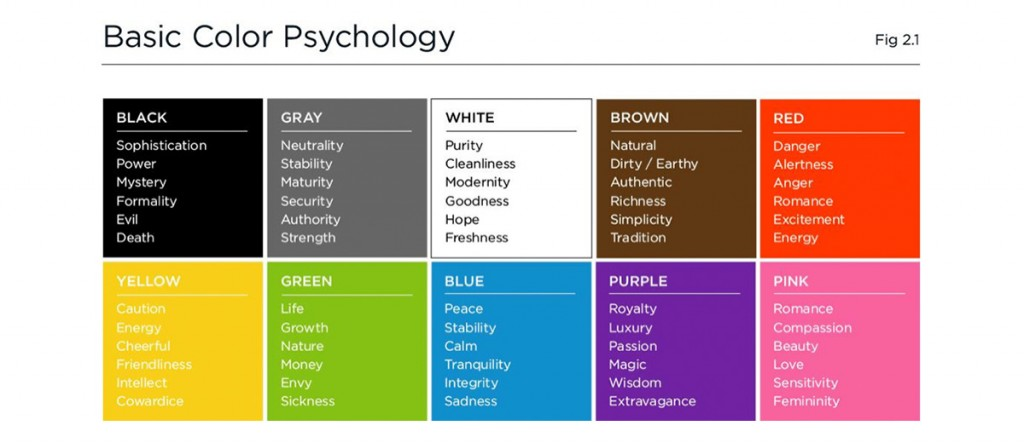
Now, there are certain bright colors (red, orange, yellow) that excite the reader. Then there are cool colors (blue, purple, green) that calm and soothe the eyes.
You can see below a basic color psychology chart depicting the emotions that a color evokes in the consumer.

Image from: slalom.com
The problem with a generalized feelings chart is,
These emotions represent us broadly.
At an individual level, the perceptions of a color are based on the culture, upbringing, personal experiences, preferences, and context.
So I am sorry, I can’t give you a checklist to create a color palette for your brand and visual adverts. But, as I have and will demonstrate how colors can captivate your audience and affect the decision-making process of the consumers. So keep in mind your choice of colors should reflect what your brand’s about.
Here’s a free tool by Adobe to help you design your color palette. I recommend you to keep it simple with 2 to 4 colors.
If your ad contains too much text, then tone down the colors. Else, you’ll end up overwhelming the prospect. The Pablo image creation tool by Buffer applies a ‘light contrast’ filter to all images by default to aid readability.

Here’s an ad by Socialbakers in which they reduce the background color intensity of the image because of the use of large text.

Let’s see a few more ads and analyze how they use colors.
The first ad that popped up in my Facebook feed was a product listing by Fiverr. They maintain the consistent green branding on all pictures with a yellowish tint. As an action-oriented marketer, I feel motivated to click through the ad.

Next, we have the earthy and pleasing Instagram ad by Gilt. The classic blue and brown combination looks elegant, soothes the eyes, yet manages to catch the attention of men (the target audience).

Image from: adespresso.com
Minimalism doesn’t equate to black and white. The Staples ad below uses cool colors and light shades for an understated charm. If you want to stay clean, organized and colorful, then you’ll love the ad.

Image from: adespresso.com
Note: You looked at the above ads in isolation. When you design for a particular platform, you’ll also need to be aware that the background color doesn’t blend. For instance, blue color ads might easily blend in when the platform is Facebook.
2. Don’t undermine typography
Besides the words in your marketing message, the choice of your typeface affects not only the overall appearance but also influences the emotions of the consumers.
Have a look at the following example of the left hand vs. right hand below. The headline font in the left is Snidely – a decorative font and it doesn’t go well with the body font – Tahoma. Whereas on the right, both the fonts (Neuton and Nevis) convey casualness.

Image from: webdesignerdepot.com
So here are the major aspects that you should consider for creating a good visual font hierarchy:
- Legibility and Readability – How well are the words and blocks of text arranged? Is an individual word character clearly distinguishable from other?
- Paragraph spacing, Font Size and Line height – The number of characters per line in your text should be generally limited to 50-60 characters. Else, you’ll end up overwhelming the reader.
Further, there must be space between lines of text. You’ll most likely be able to judge ‘bad’ line-height by looking at the appearance.

Image from: hubspot.com
- Pair fonts based on context and the moods they evoke – I would recommend restricting yourself to a couple of fonts per visual advert. It gives you the opportunity to create contrast while also being pleasing to the eye.
For instance, here’s an example of the classic combination of serif in headline vs. sans serif in body copy. Note how in the first example the fonts pair nicely, while they both fight for attention in the second.

Image from: 0to5.com
Generally, you should avoid using similar fonts since they undermine each other. But just using different fonts won’t result in a contrast (as line 3 shows in the below example).
So choose your typefaces carefully.

Image from: webdesignerdepot.com
If you need inspiration in choosing your type, then visit welovetypography.
Let me show you a couple of Facebook ad examples that use fonts right.
Look at the Ramit Sethi ad visual below with a bold font for the title. The supporting copy ‘Zero to Launch’ and ‘by Ramit Sethi’ don’t draw attention.

Image from: semrush.com
Next, look at the visual advert by Digital Marketer below. The font for the first few letters ‘The Ultimate’ are fancy and attract attention in white. The next few words ‘Digital Marketing Toolkit’ explain the offer and encourage clicking on it.

Image from: digitalmarketer.com
Facebook initially restricted using only 20% of text on an image. Now, the rule has been lifted. But it’s still recommended to keep text low in your visual advertising and use the overlay tool for help.
3. Types of Lines and Rule of Thirds
The most basic building element of art are lines. Here’s the visual feel that different kinds of lines evoke.
Horizontal lines generally bring stability to your image, give a feeling of rest and constancy.

Image from: 121clicks.com
Vertical lines generally portray height. In the church interior below, the perpendicular lines extend towards the heavens and convey spirituality.

Image from: getty.edu
Diagonal lines convey instability and motion. They grab the attention of a viewer quickly and are useful for creating points of interest.

Image credits: Angie Harms and 121clicks.com
Curves generally convey energy and sensuality.

Image from: getty.edu
Horizontal and vertical lines used together imply reliability, stability, and solidity.

Image from: sophia.org
Next important compositional aspect that you might have heard of multiple times is the rule of thirds. It makes your images more dynamic and interesting. Basically, you divide the image into 9 (imaginary) equal parts with vertical and horizontal lines. And place the object of focus at the intersections of these lines.
Here’s an example photo from Wikipedia that uses the rule of thirds.

To put things in perspective, the horizon is along the third horizontal line. And the tree is at an intersection of the two lines.

Image from: wikipedia.org
Isn’t the rule a better way to draw attention than simply placing the object at the center of the image?
Facebook officially recommends following the rule for Instagram ads. One focal point to draw people’s attention is your brand’s logo.
You can break the rule-of-thirds if you want to amplify an object’s symmetry or want to evoke an unbalanced feeling. For instance, the image below emphasizes symmetry of the table.

Image from: cambridgeincolour.com